Tuesday, December 9, 2008

I found some websites and excellent pieces of work from cartoonists all over the world. I collected them for sharing...enjoy!

http://www.judithvanistendael.be/
Here is a website--though not in English--concerning a cartoonist by the name Judith Van Istendael. The pieces of work she incorporated into her website are very good so I thought I'd share a few.


The following is a website I shared at the beginning of the year because of the outstanding artwork featured in it. Here is a remarkable examples I didn't' place on my blog the first time.


Another great website I'd like to share is http://www.artbomb.net/. If you haven't checked it out already, definitely do so. It provides inside looks at comics, their authors, gives information regarding tons of graphic novels, and even allows you to look at comic excerpts and art. A few of the previews this website offer are particularly interesting. I really suggest going to this website and looking at a few of them. I've also provided a few excerpts I thought were interesting.


Pyongyang: The Metro


I found an interesting website about the Pyongyang Metro. It's an unofficial site, of course, that provides interesting photographs, information, and external links concerning this subway system and its function. Honestly, some of the links don't work, and others are kind of funny and weird, but interesting none-the-less.


The main point of the website is to provide information concerning the speculation that the subway is merely a disguise to cover this North Korean military installation. Let me say once again this is purely speculation. Some evidence has shown that the subway was built to link underground military facilities and that it includes secret lines built for governmental use only. One truth that further propels the idea of a military installation is that at least two major military facilities are linked to the subway as well.


Aside from his conspiracy theory, the website creator gives some photos of the metro stations. One photograph he took shoes a mural in which the Great Leaders and their people are all smiling; caught in a moment of camaraderie. Their smiling faces are more than reminiscent of Guy Delisle's cover of Pyongyang. These strained grins are much like that of the students he portrayed.


Thursday, October 16, 2008

Persepolis

I have just a few random thoughts and information to share about Persepolis:

1) According to the Iran Chamber Society website, Persepolis was the ceremonial capital and governmental seat of the Achaemenian Empire in Persia under the rule of Darius the Great (who built it). http://www.iranchamber.com/history/persepolis/persepolis1.php


2) It's interesting that Marjane's last name is Satrapi. According to dictionary.com, the word satrap describes a governor of a province under the ancient Persian monarchy or a subordinate ruler, often a despotic one. http://dictionary.reference.com/browse/satrap


3) I found an interesting video of an interview with Marjane Satrapi on YouTube. She speaks candidly about her personal experiences with graphic novels as well as her family. Here's a tidbit of info: Maus was the graphic novel that instilled an appreciation and passion within Satrapi for comics. Here is the link to the video:
http://www.youtube.com/watch?v=7i9Vs97x7IU

A few thoughts on Rorschach...


Recently in my Sociology class we discussed how people react to emergency situations when in public places, in the company of others, or by themselves. It was very interesting to find out that reaction time is considerably less when an individual sees someone who needs help. Usually, people will react slower when in groups because they feel a diffusion of responsibility. One incident, in particular, that we discussed was the case concerning Kitty Genovese. Immediately, I remembered reading about his incident in Watchmen. Walter began working in the garment industry and dealt with a dress that Genovese had ordered. After her brutal murder he felt compelled to use the fabric from her dress as a mask--Rorschach was born. The fabric was "Black and white. Moving. Changing shape...but not mixing. No gray (Ch6, P10)."


The mask of Rorschach is an interesting and complicated element of his character. Several things I noticed about his mask include the fact that it is ever changing; Second, there are no eye holes and the fabric itself is clearly not see through; Third, that no matter how much is changes and reshapes, it always bears a slight resemblance to facial features. So, here are some questions to ponder: Why does Walter choose this particular ever-changing fabric, how does he see through it, and what is the significance of the distorted facial features portrayed by the mask?


1) There are several theories and much speculation as to why Walter decides to use the fabric from Genovese's dress. Of course, Rorschach himself would claim that the insanity and injustice within her murder drove him to seek a greater good in the world. However, others disagree. His doctor, for instance, believes that Walter Simply used the Genovese story to justify his actions as a vigilante, stating his case as an example of misdirected aggression.

2) I couldn't really find or muster a great answer as to how Rorschach sees through his mask. Some just claim that it is this enough to see through, but if anyone has a theory please share!

3) The fact that the patterns on his mask are ever changing is very significant yet very simple to answer. Because his mask is ever changing, it implies that Rorschach himself is enigmatic.

Tuesday, September 30, 2008

Friday, September 19, 2008

Understanding Comics: Manipulation


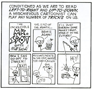
McCloud talks about the order in which we are taught to read and perceive most things: left to right, up and down. He also brings to our attention how cartoonists can and will manipulate this seemingly universal element concerning the written word. McCloud explains how our concept of time works in conjunction with the time frame of comics (104). But also goes on to illustrate how this time frame, and us, can be manipulated (105). This manipulation can either be blunt, unmissable, and necessary to the story, or it can be portrayed in a much more subtle way. For example, McCloud incorporates this kind of manipulation in his own work in chapter five. When reading pages 130-131 I simply read and perceived the visual images in the standard left-right, up-down manner. Upon finishing these two pages, however, I noticed an interesting use of frames and what was being presented in them. The frames in the middle of page 130 can not only be read with the approach we are most familiar with, but can also keep your eyes moving straight onto page 131. I didn't even notice until I'd read both pages, but it's very effective in that McCloud illustrated it to be subtle. Also, the reader wouldn't understand the point he was trying to make unless they actually finished reading the two pages and then went back a second time to read it a little differently.

It's interesting how we can be manipulated so easily by comics and not fully realize it. These elements of graphic novels and the art within them truly opens the reader's eyes to how complicated, thoughtful, and truly advanced this medium is.

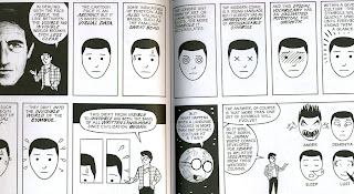
Another interesting element of manipulation McCloud incorporates into this work lies solely within the aesthetics of the layout to form greater continuity and cohesion between spreads. McCloud repeatedly uses matches from one page to another to visually bring the spread together, make it seem more coherent, and to provide an aesthetic similarity between the pages. Now, there are different types of examples concerning this. One such example can be seen in the use of frames and frame shapes. Flip through the book and check out the outside frames of the entire spread(corners in particular). McCloud often uses frames that are the same size in opposite or adjacent corners. The use of frames like this almost creates a "frame" around the spread itself. Little details such as this bring these pages together in a way that most don't realize or even see.

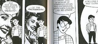
Another example is on pages 10 and 11. He matches the illustrations on page 10 to those in the middle row on page 11. Granted, the way in which he presents them is different. However, it's still aesthetically pleasing to the eye to have this visual match. In essence, it connects the two pages visually and by subject matter.

Match on shape would be yet another example of this, which can be seen on pages 56-57. The bottom, inside frames provide the reader with a darkened triangle, and while they are not perfectly identical they still provide a familiarity that once again brings the spread together as a whole. Although slightly different, we can also see this on pages 64 and 65. Once again the bottom, inside frames provide us with a match. While McCloud's face in each frame is facing different directions, the woman's face on the left and his face on page 65 are facing the same direction. Both are dominant elements in their own respective frames as well. This match, once again, provides a coherence between the two pages. It connects them in a way that is subtle but very effective.

THE DARK KNIGHT RETURNS: A Rookie's Perspective


Though Batman: The Dark Knight Returns is a compelling graphic novel, the artistic styles used seem to be much more dramatic than the actual story itself. I admit, I'm a rookie comic book reader. Therefore, I have a limited understanding and recognition of the subtle messages, the character names, or how they all came to this point in time. All in all, I was much more impressed by the art than by the story. Now, I did admit I'm a rookie comic book reader, so before anyone gets too upset with my view of this graphic novel, please allow me to illustrate :) Once again, I'm an art student so I think it's only natural for me to find the one thing within this graphic novel I can relate to and fully understand. Many artistic styles, exuberant colors, and dynamic portrayals of characters are used in Batman. Some are more stylized and simple, others are very dramatic and bold, and still others are more life-like and realistic. I think it's interesting that each of these styles was used very appropriately to portray different characters, times, moods, and memories. I love this array of color and style and feel these artistic elements kept me interested in the story. The artwork I provided in this blog are just a few of the most striking examples I noticed. Some of th images are small, so if you really want to get a better look at them (which you should!) just click on them and check it out!

Monday, September 1, 2008

The thing that appeals to me the most concerning graphic novels is the art and level of skill that is involved in creating them. As an art student it's only natural for me to have an affinity for this medium. I believe some of the best, the most advanced, interesting, and inspiring images are seen in graphic novels and other original work derived from them (concerning contemporary art). However, it's all too easy to overlook what the art does for the graphic novel. Art plays an integral part in determining the flow of the story, the mood, the action, and personality of those involved. The level of skill and creative ingenuity allows the reader to forget that they are looking at images as the story comes to life.

Here is a link that contains some very creative original art either derived or directly from comics. Artistically speaking they are very good. The use of space, line and color in many of them is very effective. Enjoy :)

http://www.graphicnovelart.com/page.asp?docid=18625