Tuesday, September 30, 2008
Friday, September 19, 2008
Understanding Comics: Manipulation
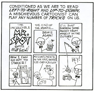
McCloud talks about the order in which we are taught to read and perceive most things: left to right, up and down. He also brings to our attention how cartoonists can and will manipulate this seemingly universal element concerning the written word. McCloud explains how our concept of time works in conjunction with the time frame of comics (104). But also goes on to illustrate how this time frame, and us, can be manipulated (105). This manipulation can either be blunt, unmissable, and necessary to the story, or it can be portrayed in a much more subtle way. For example, McCloud incorporates this kind of manipulation in his own work in chapter five. When reading pages 130-131 I simply read and perceived the visual images in the standard left-right, up-down manner. Upon finishing these two pages,
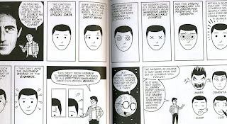 however, I noticed an interesting use of frames and what was being presented in them. The frames in the middle of page 130 can not only be read with the approach we are most familiar with, but can also keep your eyes moving straight onto page 131. I didn't even notice until I'd read both pages, but it's very effective in that McCloud illustrated it to be subtle. Also, the reader wouldn't understand the point he was trying to make unless they actually finished reading the two pages and then went back a second time to read it a little differently.
It's interesting how we can be manipulated so easily by comics and not fully realize it. These elements of graphic novels and the art within them truly opens the reader's eyes to how complicated, thoughtful, and truly advanced this medium is.
Another interesting element of manipulation McCloud incorporates into this work lies solely within the aesthetics of the layout to form greater continuity and cohesion between spreads. McCloud repeatedly uses matches from one page to another to visually bring the spread together, make it seem more coherent, and to provide an aesthetic similarity between the pages. Now, there are different types of examples concerning this. One such example can be seen in the use of frames and frame shapes. Flip through the book and check out the outside frames of the entire spread(corners in particular). McCloud often uses frames that are the same size in opposite or adjacent corners. The use of frames like this almost creates a "frame" around the spread itself. Little details such as this bring these pages together in a way that most don't realize or even see.

Another example is on pages 10 and 11. He matches the illustrations on page 10 to those in the middle row on page 11. Granted, the way in which he presents them is different. However, it's still aesthetically pleasing to the eye to have this visual match. In essence, it connects the two pages visually and by subject matter.

Match on shape would be yet another example of this, which can be seen on pages 56-57. The bottom, inside frames provide the reader with a darkened triangle, and while they are not perfectly identical they still provide a familiarity
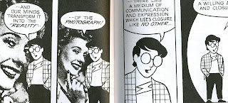 that once again brings the spread together as a whole. Although slightly different, we can also see this on pages 64 and 65. Once again the bottom, inside frames provide us with a match. While McCloud's face in each frame is facing different directions, the woman's face on the left and his face on page 65 are facing the same direction. Both are dominant elements in their own respective frames as well. This match, once again, provides a coherence between the two pages. It connects them in a way that is subtle but very effective.
THE DARK KNIGHT RETURNS: A Rookie's Perspective
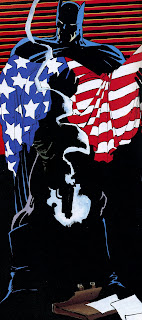

Though Batman: The Dark Knight Returns is a compelling graphic novel, the artistic styles used seem to be much more dramatic than the actual story itself. I admit, I'm a rookie comic book reader. Therefore, I have a limited understanding and recognition of the subtle messages, the character names, or how they all came to this point in time. All in all, I was much more impressed by the art than by the story. Now, I did admit I'm a rookie comic book reader, so before anyone gets too upset with my view of this graphic novel, please allow me to illustrate :) Once again, I'm
 an art student so I think it's only natural for me to find the one thing within this graphic novel I can relate to and fully understand. Many artistic styles, exuberant colors, and dynamic portrayals of characters are used in Batman. Some are more stylized and simple, others are very dramatic and bold, and still others are more life-like and realistic. I think it's
  interesting that each of these styles was used very appropriately to portray different characters, times, moods, and memories. I love this array of color and style and feel these artistic elements kept me interested in the story. The artwork I provided in this blog are just a few of the most striking examples I noticed. Some of th images are small, so if you really want to get a better look at them (which you should!) just click on them and check it out!
Monday, September 1, 2008
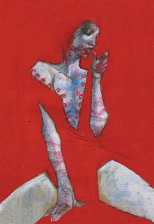 The thing that appeals to me the most concerning graphic novels is the art and level of skill that is involved in creating them. As an art student it's only natural for me to have an affinity for this medium. I believe some of the best, the most advanced, interesting, and inspiring images are seen in graphic novels and other original work derived from them (concerning contemporary art). However, it's all too easy to overlook what the art does for the graphic novel. Art plays an integral part in determining the flow of the story, the mood, the action, and personality of those involved. The level of skill and creative ingenuity allows the reader to forget that they are looking at images as the story comes to life.
Here is a link that contains some very creative original art either derived or directly from comics. Artistically speaking they are very good. The use of space, line and color in many of them is very effective. Enjoy :)
Subscribe to:
Posts (Atom)


